LMD StyleManager tutorial
LMD Style Manager
1. Introduction
LMDStyleManager object is a container class that allows to create and edit styles. LMDStyleManager can be used standalone, if no state styles are used. That is, you can apply styles to controls in runtime, but LMDStyleManager is not aware about state changes in controls. If you want styles to be applied dynamically when control changes its state, you have to link LMDStyleManager to LMDFaceController.
2. Styles storage
Style manager uses LMDIniCtrl (with MemIniFile) for internal style storing. If saved to file, styles hierarchy looks like a set of ini sections, each section represents a style:
[(Default)]

[.red]
_StyleKind=2
Color:TColor=clRed

[.red|.flat]
_StyleKind=2
Flat:Boolean=1

[.blue]
_StyleKind=2
Color:TColor=clAqua

[.blue|.flat]
_StyleKind=2
Flat:Boolean=1

[.red|.bump]
_StyleKind=2
Flat:Boolean=0

[.blue|.bump]
_StyleKind=2
Flat:Boolean=0

[.blue|.flat|.bold]
_StyleKind=2
Font.Style:TFontStyles=[fsBold]

[.blue|.flat|.norm]
_StyleKind=2
Font.Style:TFontStyles=[]
Here, _StyleKind is actually an internal dummy entry. Property lines conform to following format:
PropName:TypeName=Value
Style (section) lines conform to following format:
[ancestor style|...|style]
Style hierarchy supports any level needed and for any given style its name explicitly defines what style is the ancestor for this given style.
As we see, styles hierarchy file can be easily edited manually, if needed.
3. Styles hierarchy concept
Style is a set of property values. Styles can be arranged in a hierarchies. There are four kinds of styles:
- Default style (hierarchy root);
- Style for component;
- Specific style (user style);
- State style.
Default style name is always (Default). Component style is named by component class name. User(specific) style name always begins with dot. State styles have predefined names .focused, .hot, .readonly, .modified, .disabled, .pressed, .wrongdata. State styles can be only leaves in style hierarchy.
Currently two main hierarchy types are supported (state styles omitted):
Type 1. User styles serve to group component styles, style name qualifier is a prefix telling face controller from were it must get style to apply:
default
  userstyle1
    userstyle2
      component
Type 2. Component styles serve to group users style subhierarchies, style name qualifier can be set as a suffix to tell face controller from were it must get style to apply:
default
  component
    userstyle1
      userstyle2
Examples:
Type 1.
(Default)
  .red
    .flat
       TLMDMemo
       TLMDButton
    .bump
       TLMDMemo
       TLMDButton
  .aqua
    .flat
       TLMDMemo
       TLMDButton
    .bump
       TLMDMemo
       TLMDButton
In this example, we will have to specify prefix for face controller: .red|.flat or .aqua|.bump.
Type 2.
(Default)
  TLMDMemo
    .red
      .flat
      .bump
    .aqua
      .flat
      .bump
In this example, we will have to specify suffix for face controller: .red|.flat or .aqua|.bump.
Style hierarchy can include component hierarchy. For example, we can define style from TLMDBaseEdit and then specify styles for TLMDEdit and TLMDMemo:
(Default)
  TLMDBaseEdit
    TLMDEdit
    TLMDMemo
In this case TLMDBaseEdit style will be automatically applied to TLMDBaseEdit descendants.
4. Runtime styles handling
New style controller supports runtime writing and reading prop values, creating, renaming, erasing styles.
5. Styles editor
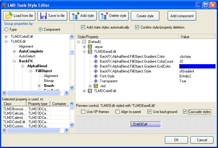
With new style editor you can:
1. Conveniently navigate through properties (initially they are grouped by components, but grouping by typename is also avaliable).
2. View a list of components/classes that use property selected in the property tree.
3. Drag & drop styles and properties while editing style hierarchy:
3.1. Create and move styles;
3.2. Add properties to styles;
3.3. Clone properties from one style to another (drag while holding SHIFT key).
4. Create style from any control on the form.
5. Add any registered component class to the property tree.
6. Preview style on a special panel
7. Automatically validate style name and placement.
6. Important notes about using styles
When a style is applied to a control, its property values are overriden by those specified by style. So, if you use state styles and property value is changed, e.g. in "mouse above" state (this value will be specified by .hot state style), then you have to define default property value for normal control state.
For example, if a style ".green" have state substyle ".hot", and in hot state font color is changed, then font color must be specified also in ".green" style. Otherwise, font color will not return to its normal value when control returns to its normal state.
Generally speaking, if there are style "A" and style "B", and they are applied to some control one after another, then these styles must specify same property sets.
7. LMDStyleManager and LMDFaceController
In order to use LMDFaceController to apply state styles dynamically, you have to add state settings objects and assign style objects to them. Normally one style is assigned to one state.
Then you can set StyleName property of LMDFaceController to specify style to read properties from. If this style has state substyles, then LMDFaceController will apply this substyles to controlls dynamically. Of course, these controls have to support ILMDFaceController interface.
8. New in LMDFaceController
Besides style support, LMDFaceController received one new method and one event:
- FillControlList
- OnSetFaceController
FillControlList method gathers all controls that support ILMDFaceController interface and sets their FaceController property to the instance from which the method is called.
Before changing controll's FaceController property, FillControlList method triggers OnSetFaceController event, where programmer can allow or disallow changing controll's FaceController property.
