LMDThemes GradientRenderer
The new gradient theme renderer
Overview
New units
The new gradient theme engine was intended to implement themes imitating Office 2007 look. Actually it allows to build and use a wider variety of themes. It uses universal and
flexible architecture of gradient fillers which allows to combine complex configurations of gradients.
These configurations, from the simplest to complex are:
- Solid filler;
- Gradient filler;
- Composition of fillers (any number of rectangular areas);
- Mix of fillers, where each filler in a blend has its weight;
- Mix of composition of fillers.
In order to implement the new renderer, we added several new graphical units, which can also be used separately. These are: LMDFillers, LMDFigures, LMDGradientFrames.
LMDFillers
LMDFillers unit contains base TLMDFiller class and its descendants for painting surfaces and borders of figures: - TLMDSolidFiller (floodfills figure with given color);
- TLMDVerticalGradient, TLMDHorizontalGradient, TLMDEllipseFiller, TLMDRoundFiller, TLMDLineFiller, TLMDRectangleFiller, TLMDBandFiller (floodfills figure with a given gradient);
- TLMDCompositeFiller (floodfilles rectangular areas with given gradients);
- TLMDMixedFillers (floodfills figure with a blend of gradients).
LMDFigures
LMDFigures unit contains TLMDFigure class and its descendants:
-TLMDRectangle, TLMDCustomCutRectangle, TLMDRoundRectangle;
-TLMDLine;
-TLMDEllipse, TLMDCircle;
-TLMDUnionFigure, TLMDSubtractionFigure.
LMDGradientFrames
LMDGradientFrames unit contains TLMDBaseGradientFrame class and its descendants for painting different gradient frames:
-TLMDGradientRectFrame draws rectangular frames consisting of three parts (outer border, inner space, inner border). These frames can have three types of corners: rectangular,
round and line. Each corner of a frame can have its own cut type.
-TLMDGradientCircleFrame draws round frames consisting of three parts (outer border, inner space, inner border).
-TLMDGradientCmpFrame draws complex frames consisting of three sets of parts: outer borders parts, inner space parts and inner border parts, each set of parts consists of 4 sides
and 4 corners. This class is not used for rendering Office2007-like themes.
Functionality
The new renderer
- implements interface declared in TLMDThemeServices class (LMDThemes unit);
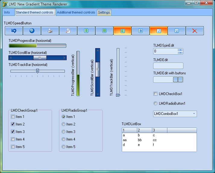
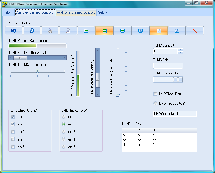
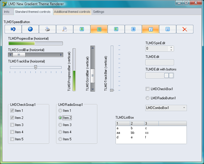
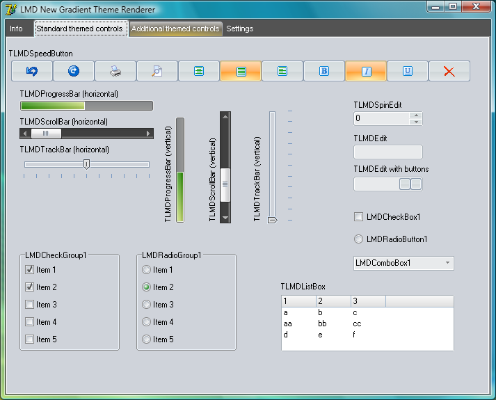
- allows to use Office2007-like themes (three built-in color schemes: blue, metallic, black);
- allows to get access to its settings via helper properties;
- allows to change colors and brightness for several elements at a time;
- can store themes in XML file;
- can read themes from XML file and from CAB file (if it contains XML theme file).
Structure
Each themed element has two arrays of corresponding descriptors, array of fill descriptors and array of frame descriptors:
ButtonFill:  array[TThemedButton] of TLMDGradientThemeFillDescriptor;
ButtonFrame: array[TThemedButton] of TLMDGradientThemeFrameDescriptor;
Also, themed element can have array of text descriptors, but in current version text descriptor is used only for setting colors of font in tab text (for teTab element).
A gradient theme descriptor is a record that consists of parameters section and filler section:
type
  TLMDGradientThemeFillDescriptor = record
    Params: TLMDGradientThemeFillParams;
    Fillers: array[TLMDGradientFillPart] of TLMDFiller;
  end;

type
  TLMDGradientThemeFrameDescriptor = record
    Params: TLMDGradientThemeFrameParams;
    Fillers: array[TLMDGradientSFramePart] of TLMDFiller;
  end;
A fill descriptor determines how element's inner surface is painted, whereas a frame descriptor determines how element's frame is painted.
Usage
Loading and activating
Nothing was changed here: in order to use the new renderer you have to put a reference to LMDThemesGradientThemeRenderer unit somewhere in your application. Initialization section of this unit registers renderer so that application can use it for painting controls with ThemeMode = ttmNative. When renderer is active, active theme and color scheme can be changed by loading theme from file
LMDThemeServices.ActivateTheme('Office2007.cab', 'Metallic');
or by activating built-in color scheme:
LMDThemeServices.ActivateColorScheme('Black');
Usually you do not have to deactivate theme directly, it is performed automatically when needed.
Changing colors and other params in run-time
Mass changing methods
There are three methods that allow to change colors for several themed elements/details at a time:
procedure ChangeBrightness(aPercent: integer; aElements: TThemedElementSet = []; aDetailNameMask: string = ''; aFillParts: TLMDGradientFillParts = cGradientFillAllParts; aFrameParts: TLMDGradientSFrameParts = cGradientSFrameAllParts; aIndex: integer = -1);

procedure ReplaceColor(aOldColor, aNewColor: TColor; aElements: TThemedElementSet = []; aDetailNameMask: string = ''; aFillParts: TLMDGradientFillParts = cGradientFillAllParts; aFrameParts: TLMDGradientSFrameParts = cGradientSFrameAllParts; aIndex: integer = -1);

procedure SetNewColor(aNewColor: TColor; aElements: TThemedElementSet = []; aDetailNameMask: string = ''; aFillParts: TLMDGradientFillParts = cGradientFillAllParts; aFrameParts: TLMDGradientSFrameParts = cGradientSFrameAllParts; aIndex: integer = 0);
Each of these methods walks through all fillers for given element, given detail name mask, fill or frame part and performs required change.
Note: ChangeBrightness and ReplaceColor apply change for all color entries starting from given index , whereas SetNewColor changes one color entry with a given index.
Examples:
//walks through all fillers for teTab element, for details like 'ttTopTabItem*'
 //and sets new color for each FixedColors entry with index 0
 SetNewColor($0000FFFF, [teTab], 'ttTopTabItemHot*', [gfpMain], [], 0);

 //replaces each color entry with value $00F8E0CE by a new value $00F8D0BE
 ReplaceColor($00F8E0CE, $00F8D0BE);

 //Changes brightness of all colors:
 ChangeBrightness(-10, []);
Direct access to colors and filler properties
Properties like *FillFiller, *FrameFiller allow to get direct access to fillers. Using them requires knowledge of how the filler is structured. Filler structure can be browsed in XML file. For
Office2007-like themes a filler is usually either solid filler, vertical/horizontal/elliptic gradient, composite filler of a mixed filler.
Changing colors
For example, this is how we can change start gradient color for teTab element, detail ttTopTabItemHot:
    with CThemeRenderer do
         TLMDCompositeFiller(TLMDMixedFiller(TabFillFiller[ttTopTabItemHot, gfpMain]).Item[0]).Item[0].FixedColors[0] := clRed;
This is rather complex construction because the filler in this case is a mix of composite filler and elliptic gradient:
<FillDescriptor>
	<Params>
		<gflpRenderMode Value="4"/>
	</Params>
	<Fillers>
		<Filler Class="TLMDMixedFiller" Part="gfpMain" ItemCount="2">
			<UseRelativeUnits Value="1"/>
			<Item Index="0" Weight="255">
				<Filler Class="TLMDCompositeFiller" ItemCount="2">
					<UseRelativeUnits Value="1"/>
					<Item Index="0">
						<FillerRect Left="0" Top="0" Right="100" Bottom="45"/>
						<Filler Class="TLMDVerticalGradient">
							<Colors ColorCount="2">
								<Color0 Value="$00FEDDC4"/>
								<Color1 Value="clWhite"/>
							</Colors>
						</Filler>
					</Item>
					<Item Index="1">
						<FillerRect Left="0" Top="45" Right="100" Bottom="100"/>
						<Filler Class="TLMDVerticalGradient">
							<Colors ColorCount="2">
								<Color0 Value="$00FEDDC4"/>
								<Color1 Value="clWhite"/>
							</Colors>
						</Filler>
					</Item>
				</Filler>
			</Item>
			<Item Index="1" Weight="255">
				<Filler Class="TLMDEllipseFiller">
					<UseRelativeUnits Value="1"/>
					<BasePoint X="50" Y="0"/>
					<Axis1 Value="80"/>
					<Axis2 Value="80"/>
					<FirstAxisDirection X="1" Y="0"/>
					<Colors ColorCount="2">
						<Color0 Value="$00FEDDC4"/>
						<Color1 Value="$0098D1E3"/>
					</Colors>
				</Filler>
			</Item>
		</Filler>
	</Fillers>
</FillDescriptor>
So, we have to take filler for main fill part (gfpMain index), ttTopTabItemHot detail:
TabFillFiller[ttTopTabItemHot, gfpMain]
then cast it to TLMDMixed filler and take the first item, which is a composite filler:
TLMDMixedFiller( * ).Item[0])
then cast it to TLMDCompositeFiller and take the first item which is a vertical gradient, and change the first color:
TLMDCompositeFiller( * ).Item[0].FixedColors[0] := clRed;
Changing other filler properties
Each filler has BasePoint property which determines the coordinate origin for filler.
Example:
    with CThemeRenderer do
      begin
        //This will change base point of ellipse gradient filler (bottom part of the filler)
        //Coordinates are relative to rectangle of the element: (100, 100) is
        //the bottom right corner
        TLMDCompositeFiller(ButtonFillFiller[tbPushButtonPressed, gfpMain]).Item[1].BasePoint := Point(100, 100);
        TLMDCompositeFiller(ButtonFillFiller[tbPushButtonHot, gfpMain]).Item[1].BasePoint := Point(0, 100);
       end;
Parameters - detailed description
Parameters section is a simple one for fill descriptors and rather complex for frame descriptors. However, each parameter is a byte.
Fill descriptors
Here we have one parameter: gflpRenderMode (prefix gflp: gradient fill parameter)
type
 TLMDGradientThemeFillParam = (gflpRenderMode);
Bits 0..1: 0 - standard, 1 - sketch, 2 and 3 - reservedBit 2 - antialiasing for gfpMain Bits 3..6 - antialiasing for gfpDeco1..gfpDeco4Standard value is 4: 0000 0010
Frame descriptors
Here we have a lot of parameters (prefix gfrp: gradient frame parameter).
Most of frame parameters relate to determining how corners of a frame should look. For custom cut rectangle, CutX and CutY are the values that, along with corner cut type, determine how corner looks. E.g. here is a round-cut corner with its CutX and CutY values:
Since there are three possible areas of a frame (outer border, inner space and inner border), each of which can have its own corners description, the number of paramet
ers section of a frame descriptor is about 40:
type
 TLMDGradientThemeFrameParam =
 (
 //gfrpRenderMode
 //bits 0..1: 0 - standard, 1 - sketch, 2 and 3 - reserved
 //bit 2: outerborder antialasing flag - 4
 //bit 3: outerborder soft edge flag - 8
 //bit 4: innerspace antialasing flag - 16
 //bit 5: innerspace soft edge flag - 32
 //bit 6: innerborder antialasing flag - 64
 //bit 7: innerborder soft edge flag - 128
 //---------------- bits 7654 3210
 //standard value is 84: 0101 0100
 gfrpRenderMode,

 //determine what sides of the border should be drawn
 gfrpOuterBorderSides,
 gfrpInnerBorderSides,

 //determine edge width - each of border areas can have edges. Not used for Office2007-like themes
 gfrpOuterBorderEdgeWidth,
 gfrpInnerBorderEdgeWidth,
 gfrpSpaceEdgeWidth,

 //determine border areas width
 gfrpOuterBorderWidth, gfrpInnerBorderWidth,
 //determines gap width between border area and innerspace area
 gfrpOuterBorderGap, gfrpInnerBorderGap,

 //determine inner space widths
 gfrpTopSpaceWidth, gfrpRightSpaceWidth,
 gfrpBottomSpaceWidth, gfrpLeftSpaceWidth,

 //determines how cut values are calculated
 //Possible values are
 //cvuBoth - both cut values are used
 //cvuXOnly - only CutX value is used
 //cvuYOnly - only CutY value is used
 //cvuMin - minimum of CutX and CutY values is used
 //cvuMax - maximum of CutX and CutY values is used
 //cvuAverage - average of CutX and CutY values is used
 gfrpCutValueUsage,

 //determine inner and outer cut type for outer border
 //Possible values are ctNone (rectangular corner), ctLine (line-cut corner), ctRound (rounded corner)
 gfrpOuterBorderInnerCutType, gfrpOuterBorderOuterCutType,

 //CutX and CutY values for inner and outer corners of outer border
 gfrpOuterBorderInnerCutX, gfrpOuterBorderInnerCutY,
 gfrpOuterBorderOuterCutX, gfrpOuterBorderOuterCutY,

 //value types for outer border cut values
 //Possible values are vtAbsolute, vtPercent
 gfrpOuterBorderInnerCutXValueType, gfrpOuterBorderInnerCutYValueType,
 gfrpOuterBorderOuterCutXValueType, gfrpOuterBorderOuterCutYValueType,

 //determine inner and outer cut type for inner space
 gfrpInnerSpaceInnerCutType, gfrpInnerSpaceOuterCutType,

 //CutX and CutY values for inner and outer corners of inner space
 gfrpInnerSpaceInnerCutX, gfrpInnerSpaceInnerCutY,
 gfrpInnerSpaceOuterCutX, gfrpInnerSpaceOuterCutY,

 //value types for inner space cut values
 gfrpInnerSpaceInnerCutXValueType, gfrpInnerSpaceInnerCutYValueType,
 gfrpInnerSpaceOuterCutXValueType, gfrpInnerSpaceOuterCutYValueType,

 //determine inner and outer cut type for inner border
 gfrpInnerBorderOuterCutType, gfrpInnerBorderInnerCutType,

 //CutX and CutY values for inner and outer corners of inner border
 gfrpInnerBorderOuterCutX, gfrpInnerBorderOuterCutY,
 gfrpInnerBorderInnerCutX, gfrpInnerBorderInnerCutY,

 //value types for inner border cut values
 gfrpInnerBorderOuterCutXValueType, gfrpInnerBorderOuterCutYValueType,
 gfrpInnerBorderInnerCutXValueType, gfrpInnerBorderInnerCutYValueType);
Screenshots
Predefined color schemes
ElXTree, ElToolBar and LMDButtonBar
With blue color scheme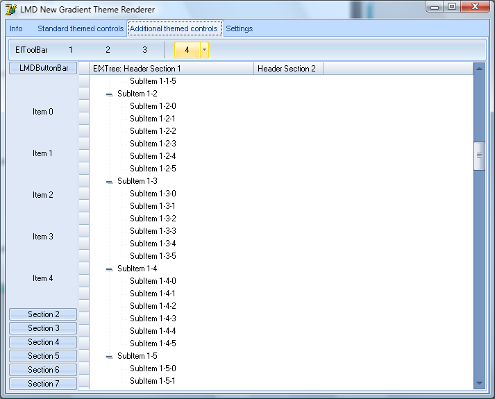
With black color scheme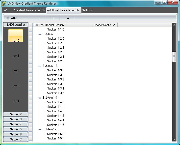
Changing colors at runtime

Third gradient area added for push buttons
Base point changed for push buttons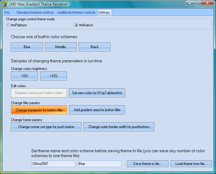
Dark blue scheme (brightness -30%)